
Big Data is an another phrase that’s become rather popularised recently along with Fintech, Blockchain etc etc… Practical application examples are rather limited when you push some of the advocates.
However, this story from Transport for London (TfL) is a great example of marrying big data you hold (in this case oyster card touch ins) with data from wifi beacons on the London Underground and trains…
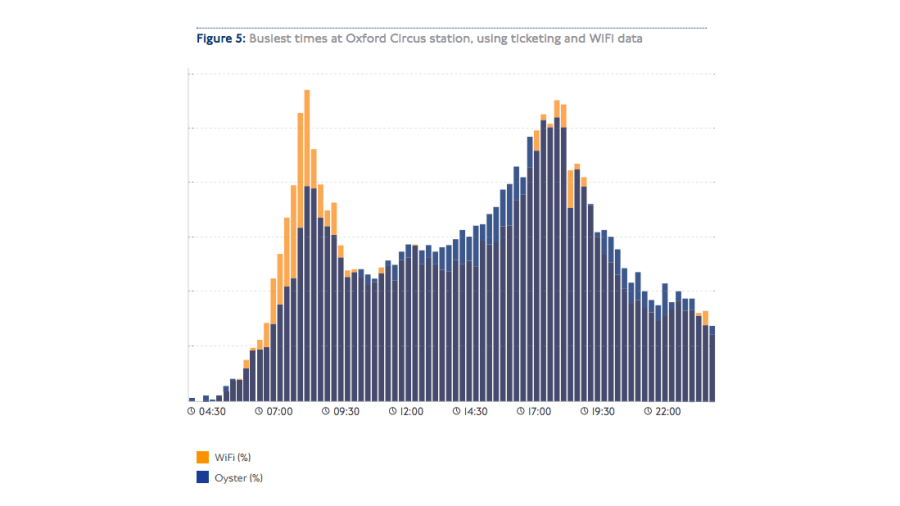 The wifi data also enables TfL to generate more accurate data on crowding in stations. The above graph compares the number of Oyster touch-ins with wireless device detections over the course of the day.
Previously, how busy a station was could only be measured using Oyster touch in data but there’s a fairly big flaw in using this: There’s a fairly hard limit on how many people can use a set of ticket barriers at any one time. So measuring it by touch-ins doesn’t account for hundreds or thousands of grumpy commuters in the queue.
The wifi data, by contrast, accounts for these people as it still picks up their phones – and comparing it with Oyster touch-ins gives a really immediate and stark example of when it is particularly crowded, such as at Oxford Circus during morning and evening peak.
It’s a great example with a multitude of examples.. think of a bank branch with free wifi, how many people actually go and see a counter teller or just give up and if they give up, which other branch do they go to.
Knowing how people behave is one thing: But what about when something goes wrong? When the Waterloo and City Line went down on the morning 9th December, thousands of commuters were suddenly shaken out of the sort of robotic trance you go into when you repeat a journey so many times. Instead, they had to get to work by alternative means – but which route did they choose?
Many adjacent routes were impacted, in terms of actual numbers, this meant that 4,000 people decided to take the Jubilee Line, 3,000 took the Bakerloo Line to Embankment Station. By the time everyone got to Embankment Station, the tube network had to cope with an extra 6,000 people taking the Circle and District line eastbound to Monument Station. The TfL report reckons that translates to approximately 150 extra onboard on each train arriving.
We talked in an earlier post about the importance of data. How much data does your organisation hold ? Is it organised effectively and can you gather insights like the above to drive a better customer experience (and profitability)!
The full TfL report can be found here
best
MN
